
Project Overview
Our Role
Problem to Solve
Creative Process
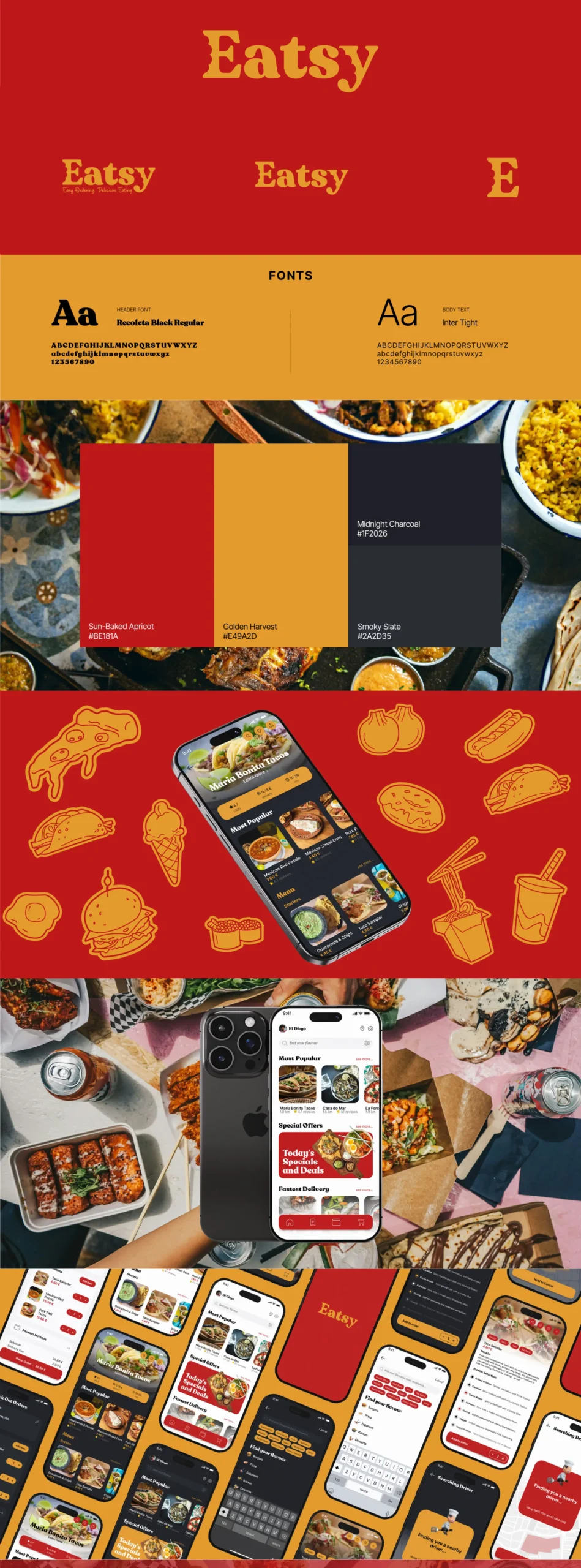
We began with research into both the client’s vision and the current food delivery trends in Portugal. Through this process, we identified the desired emotional tone: warm, classic, and approachable. Vintage fast-food typography inspired the choice of typeface, which feels bold, friendly, and timeless. The primary colors were selected to be rich, appetizing, and warm, supported by neutral tones used primarily for backgrounds, especially in dark mode.
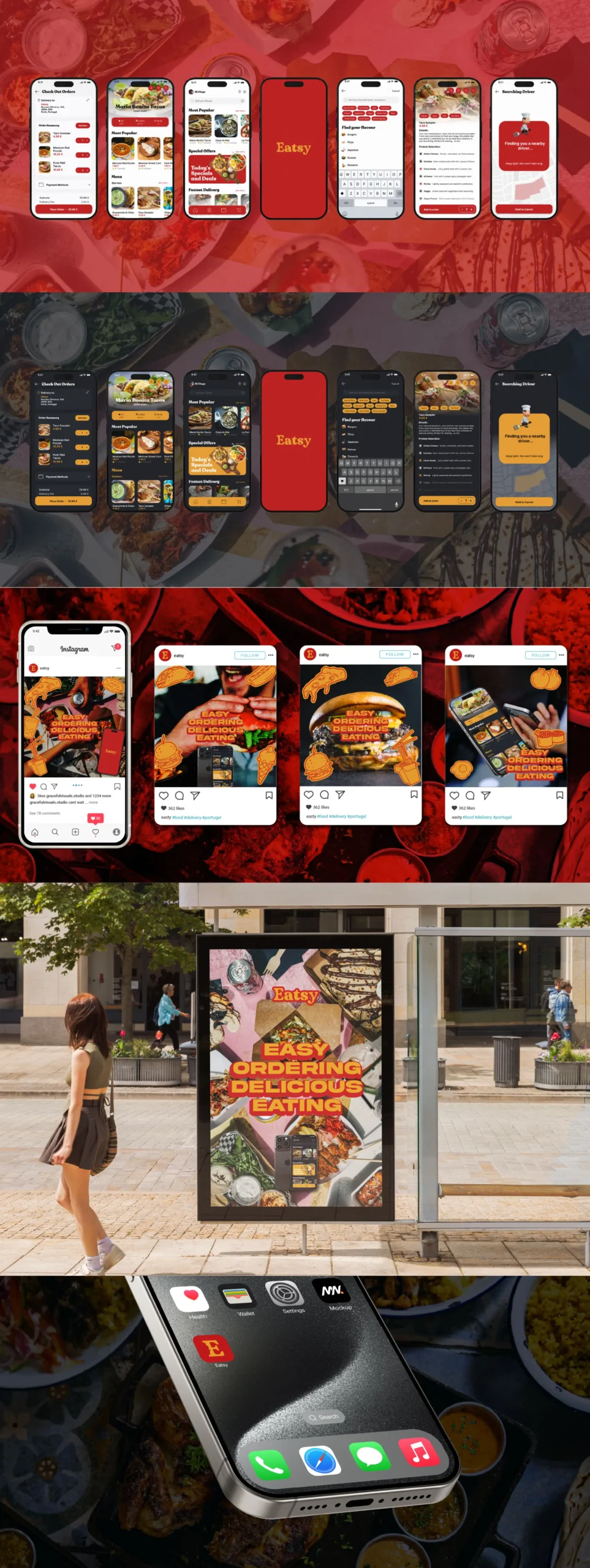
When developing the UI, we ensured both light and dark modes felt consistent and aligned with the brand’s visual language. Navigation was designed for speed and ease, making ordering simple even for users in areas with limited delivery options. The food photography feature was integrated seamlessly, allowing the brand’s classic and comforting imagery to shine.
For promotional design, we created adaptable social media templates for campaigns targeting new users, bus stop posters for key urban locations, and a set of branded stickers to engage younger audiences playfully and memorably. The offline strategy focused on reaching commuters and high-traffic areas to complement the strong online presence.
Outcome
Eatsy’s dual-mode UI, nostalgic visual identity, and targeted promotional strategy position it as a memorable competitor in Portugal’s growing food delivery market. The blend of retro charm and modern functionality gives the brand an emotional edge while keeping the interface practical and intuitive. With a launch strategy that combines both online and strategic offline touchpoints, Eatsy is prepared to connect with users in urban centers and underserved areas, offering a unique and welcoming alternative to traditional food delivery experiences.


